Branding and rebranding are the art of defining and redefining who you are. They go beyond mere aesthetics; they capture the essence of your business. At GEN Solutions, we take your brand’s genetic blueprint and transform it into a compelling visual and verbal identity that resonates with your audience. Our approach is rooted in creativity that connects, building brands that are as unique and dynamic as you are.
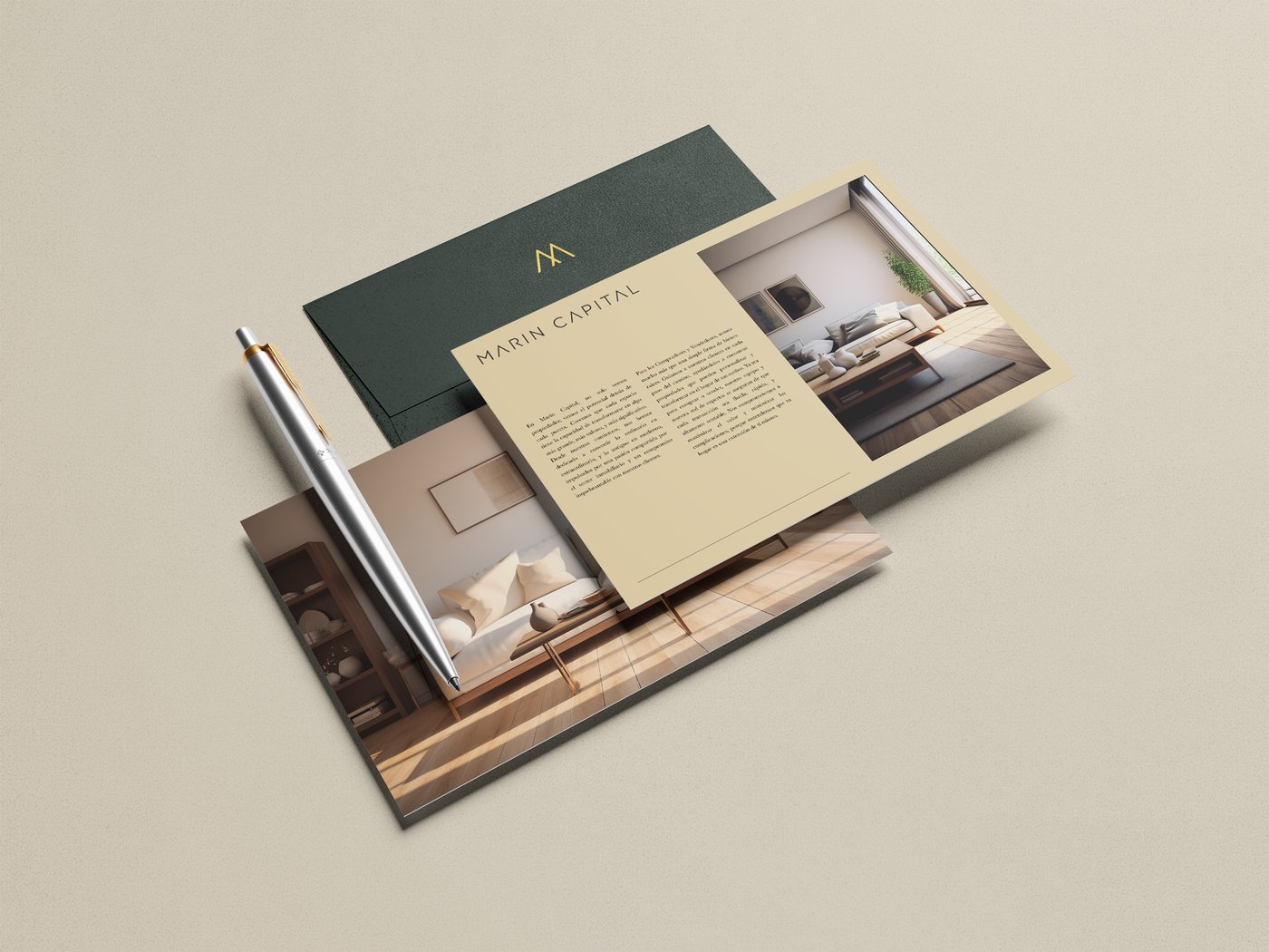
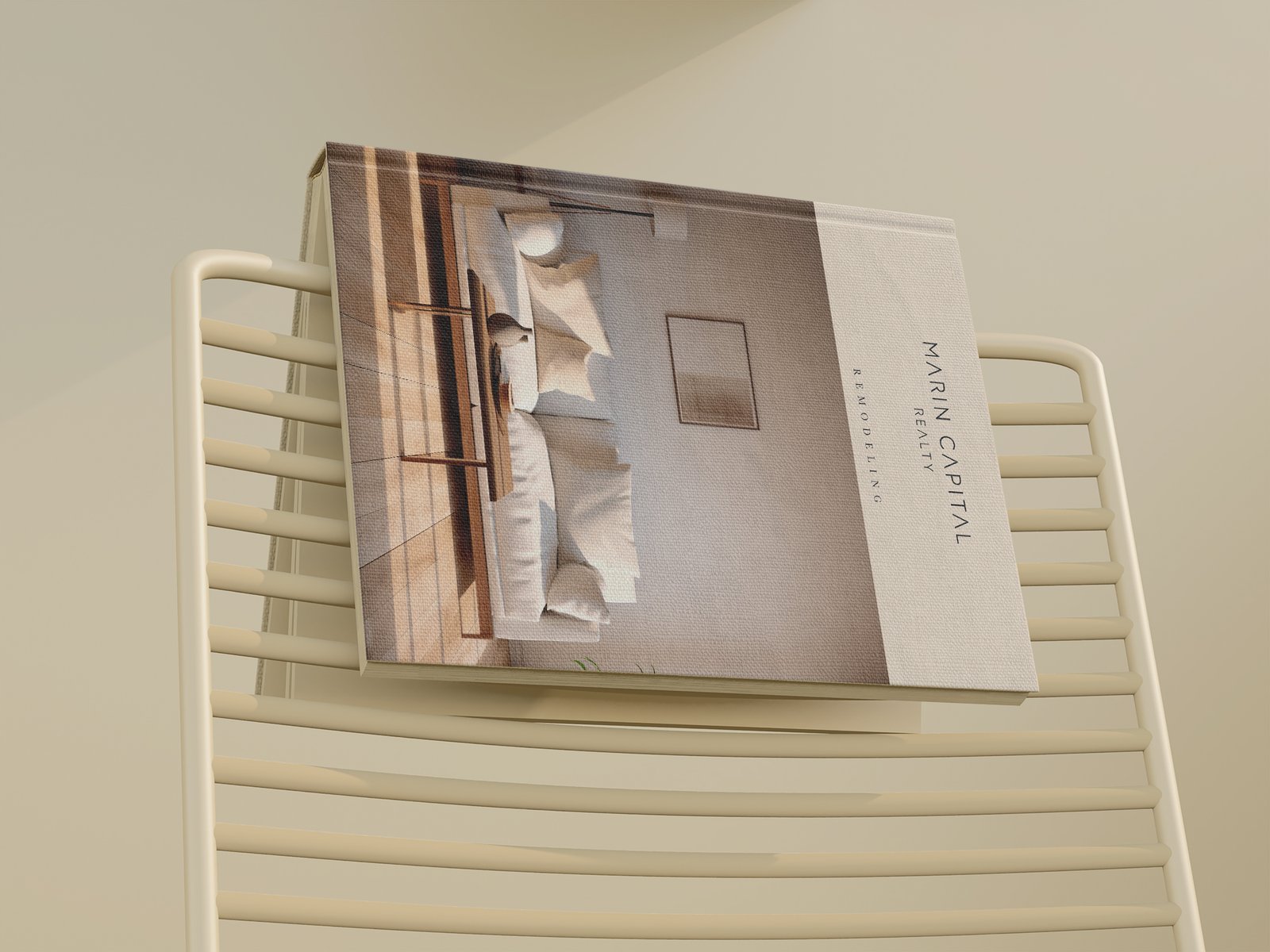
Marin Capital projects a brand personality that combines intelligence and empowerment with innovation and creativity. Its professional and sophisticated approach reflects deep expertise in the real estate market, while its friendly and organized attitude ensures a smooth and personalized experience for clients. The brand distinguishes itself by offering advanced and elegant solutions, always maintaining a high level of class in every interaction and project.
Identity
Marin Capital is a brand that doesn’t believe every property is merely a structure. They see opportunity behind every door—a space waiting to be transformed into something greater, more valuable, and filled with meaning. From day one, Marin Capital has reimagined the ordinary, turning old spaces into modern marvels with passion and an unwavering commitment to their clients
Construction & Design
Process & concept
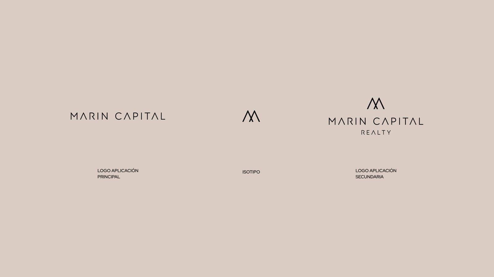
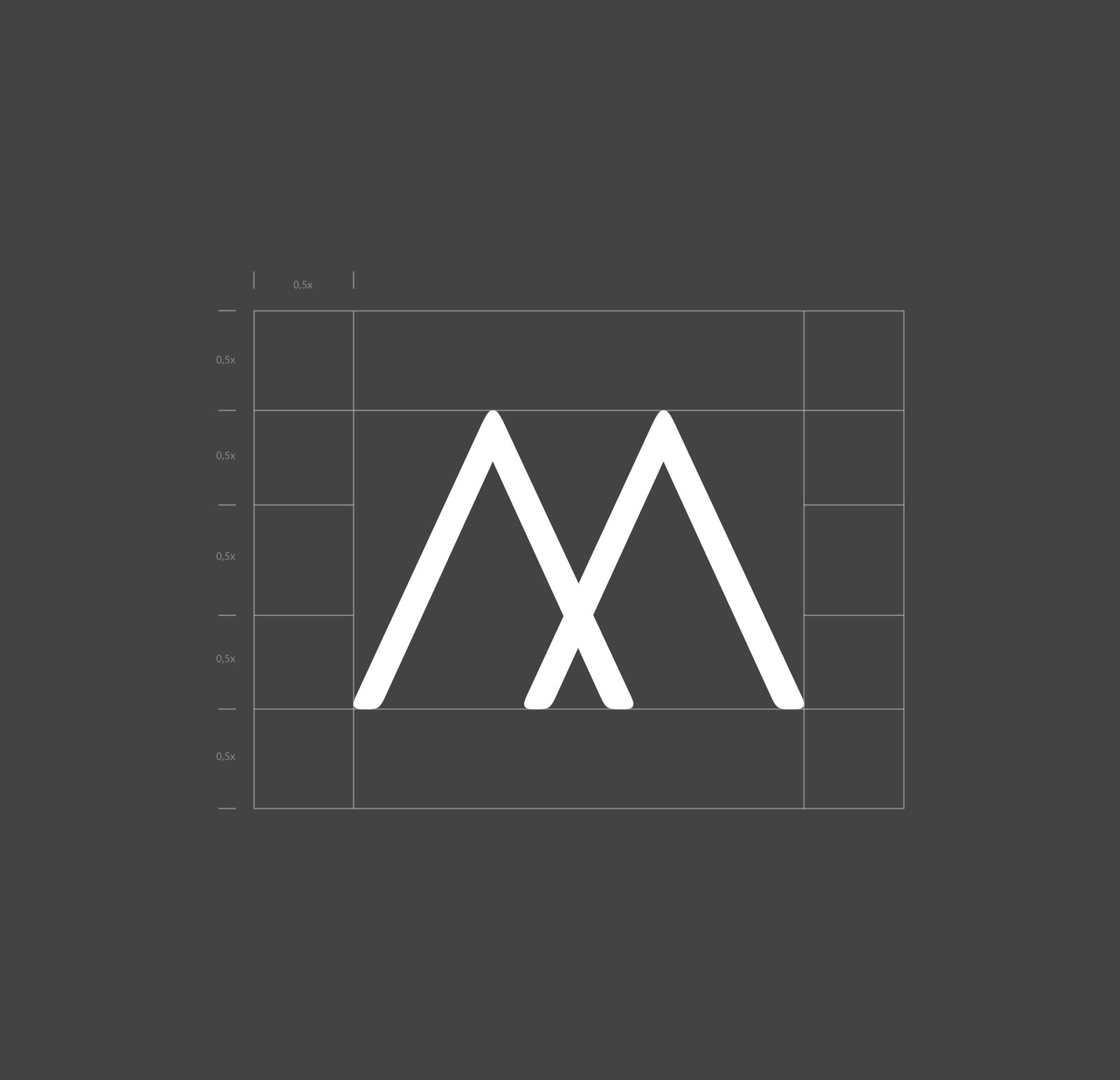
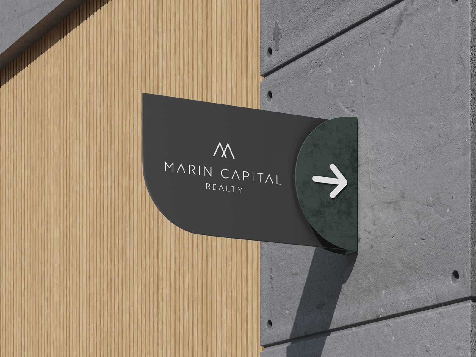
The visual identity of Marin Capital evokes a sense of luxury and sophistication through the predominant use of dark gray (charcoal black), symbolizing elegance and class. This dominant color will be contrasted with earth tones that will add a dimension of warmth and closeness, reflecting the brand’s friendliness and accessibility to its clients.
I highly recommend GEN Solutions. I hired them to create my company’s branding and website, and they exceeded every expectation. Their punctuality, organization, and dedication truly set them apart. The website they developed is outstanding, and I’m incredibly grateful for their exceptional work. Thank you to the GEN Solutions team!
Catalina Marin – Founder and CEO
BRAND:
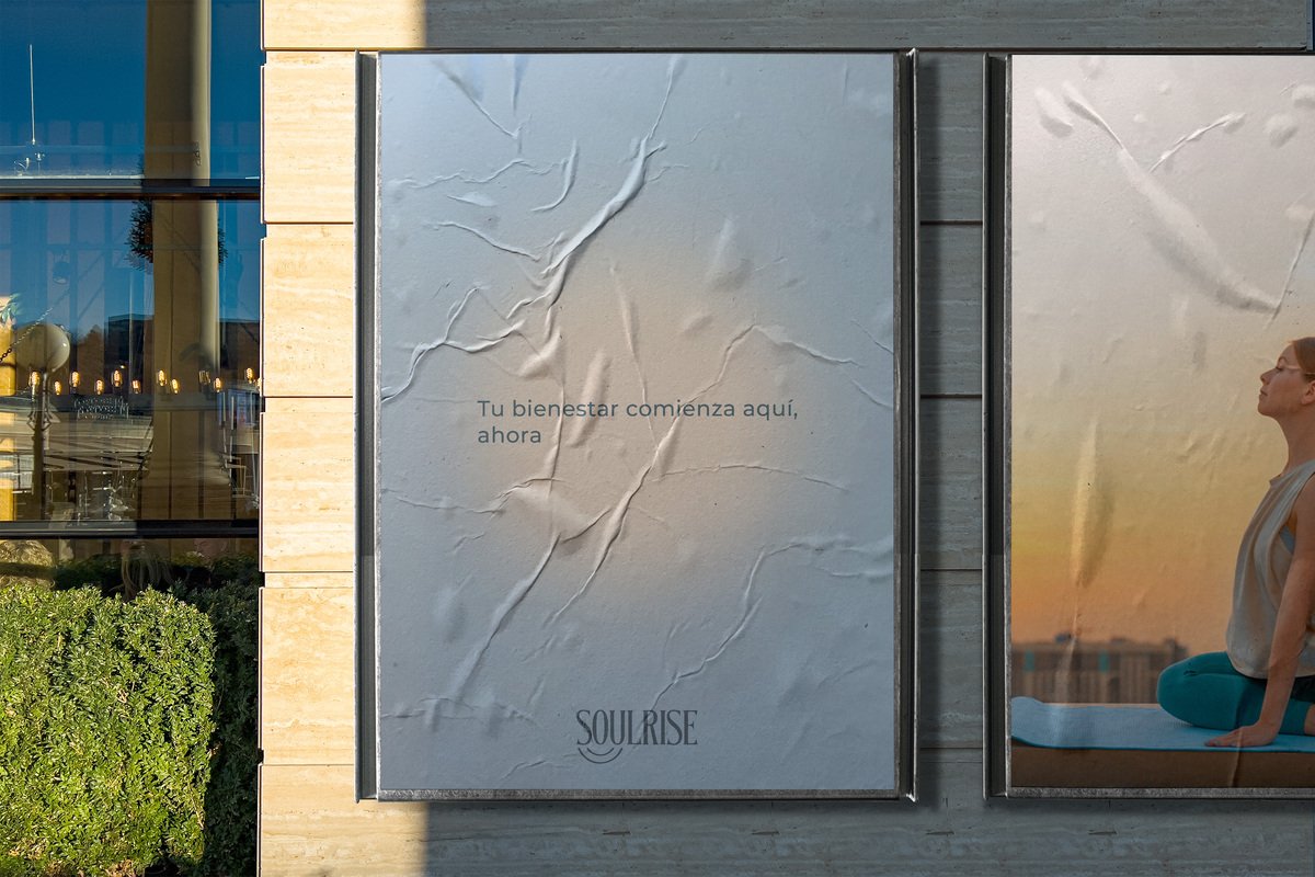
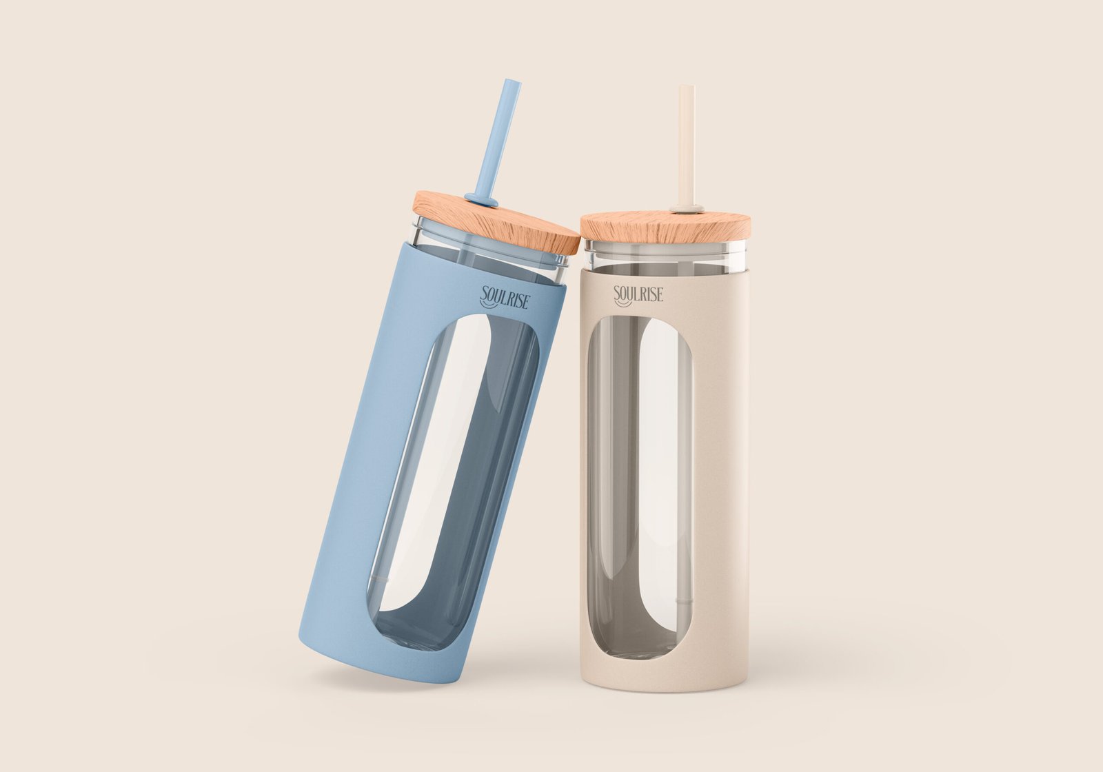
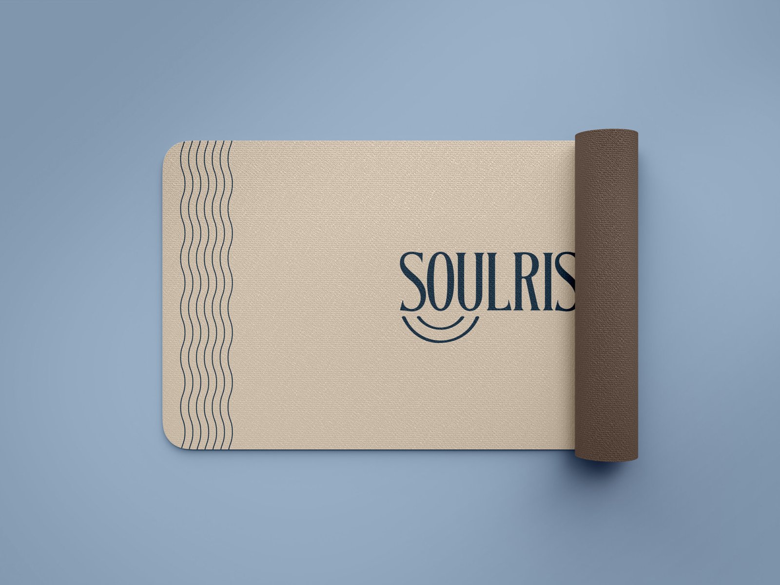
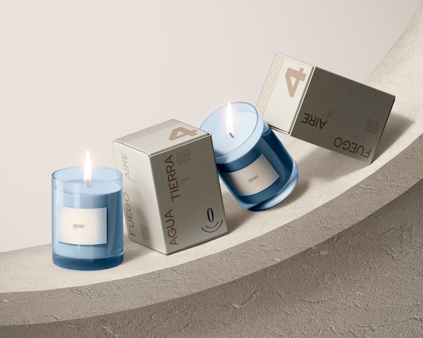
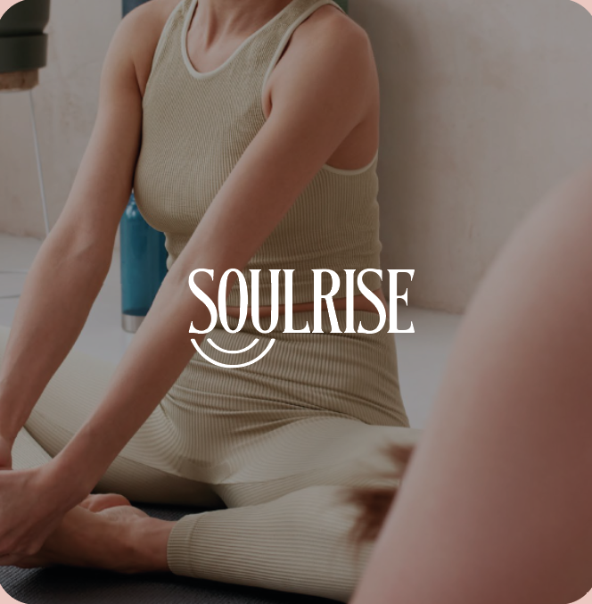
Soulrise
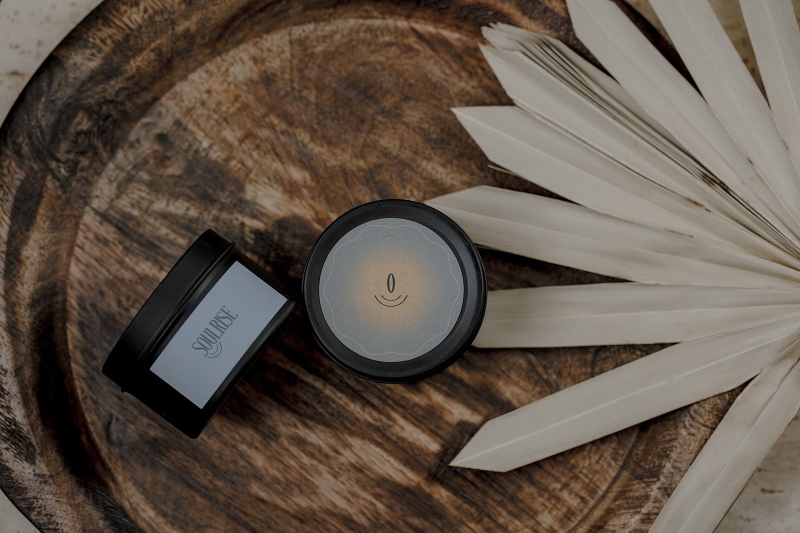
Soulrise is a brand that sees beyond aesthetics—crafting an atmosphere where nature and calm coexist. With inviting textures that echo the warmth of nature and a color palette inspired by the earth’s soft whispers, Soulrise transforms spaces into peaceful retreats that nurture the soul
Identity
Soulrise emerged from a profound personal journey rather than from corporate planning. In a pivotal moment, its founder was reminded that real health transcends physical appearance—it encompasses the wellness of the mind and the spirit. That transformative insight laid the foundation for a brand committed to nurturing a balanced, holistic way of living.
Construction & Design
Process & concept
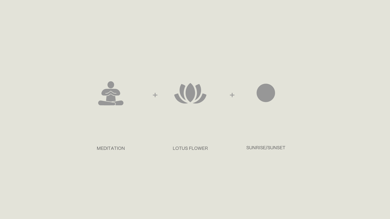
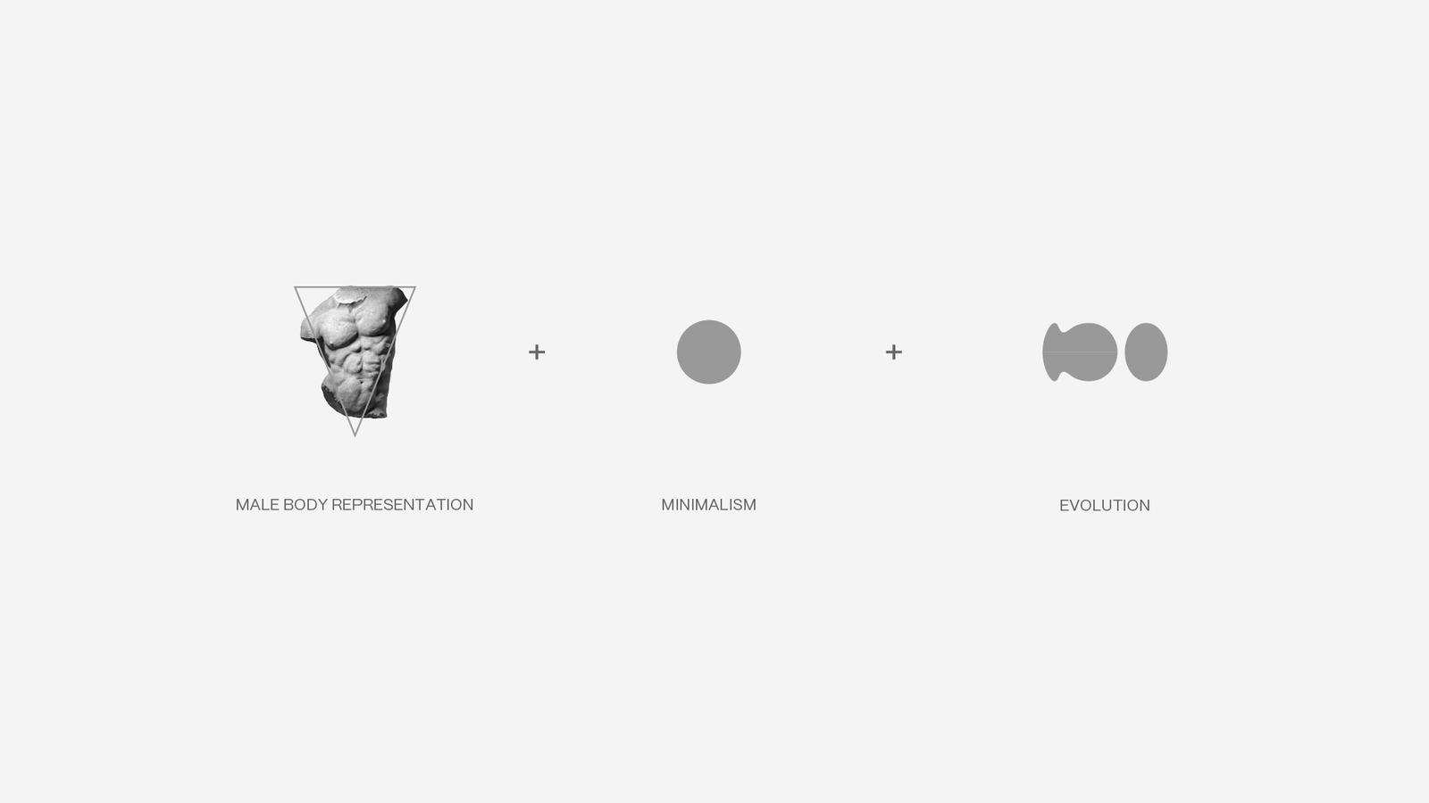
The Soulrise brand is built on a precise visual system with a balanced palette of earthy and neutral tones for contrast and readability. Typography is anchored in Montserrat, a geometric sans-serif font applied in varying weights for clear hierarchy. Organic textures inspired by nature add depth without overpowering the design. The grid-based logo integrates a meditation posture, lotus flower, and sunrise arc, ensuring proportional integrity across digital and print. Every element is structured for consistency and scalability.
I’m incredibly impressed with the work GEN Solutions did for Soulrise. They brought our idea to life with a design that not only embodies calm and balance but also tells our story in a truly compelling way. Their expertise and dedication shone through every step of the process, resulting in a brand identity that resonates deeply with our values. Thank you, GEN Solutions, for making this journey unforgettable.
LeOM Moreno – Founder
BRAND:
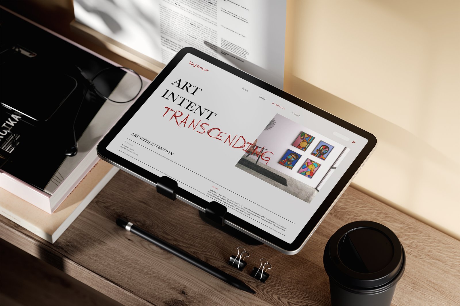
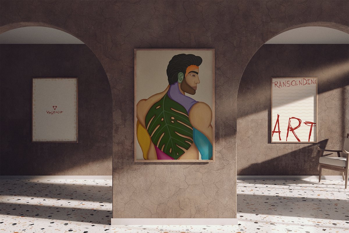
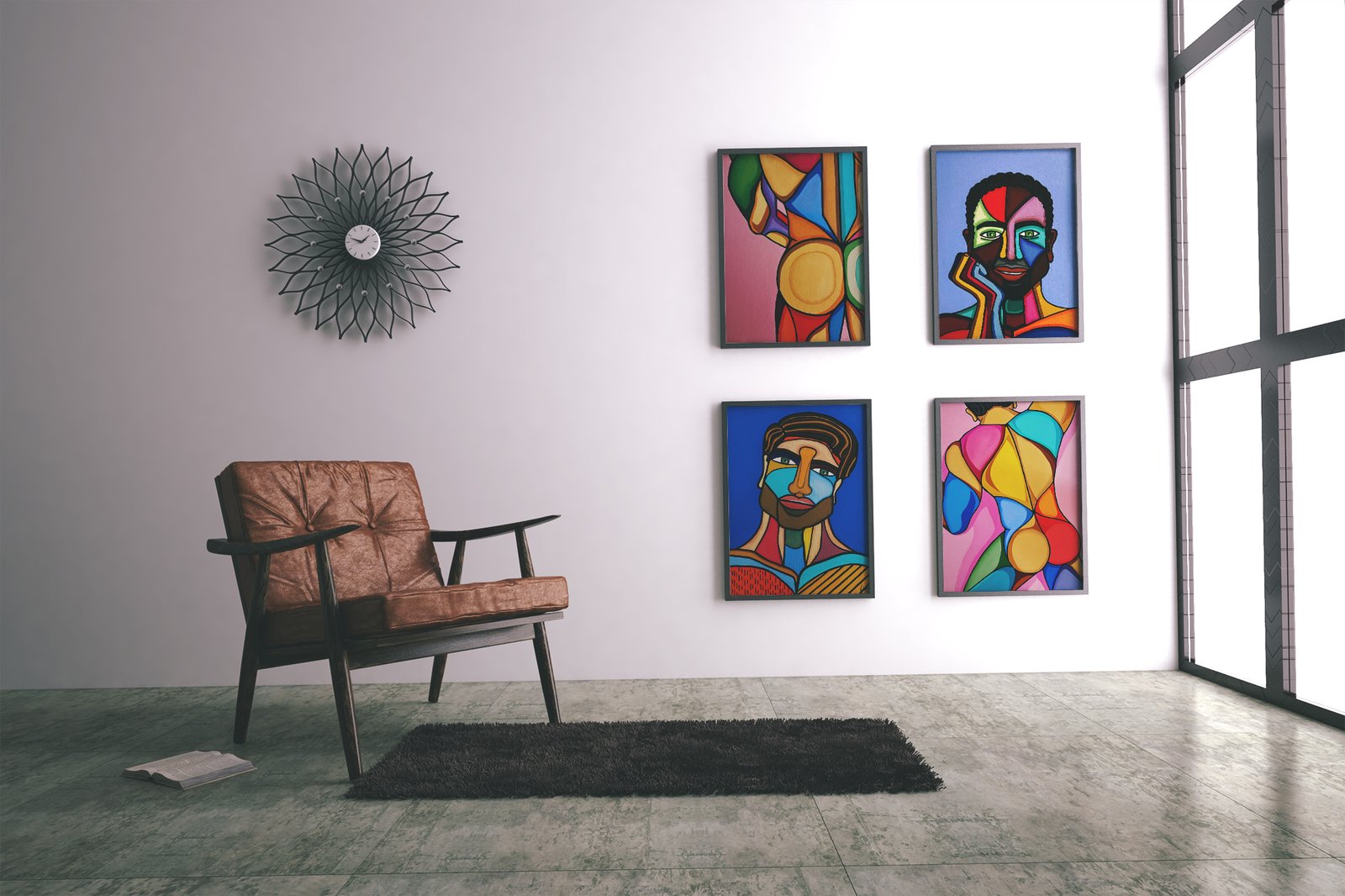
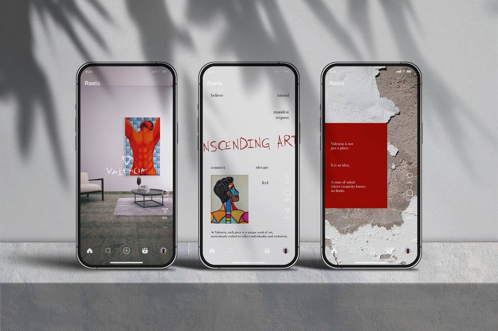
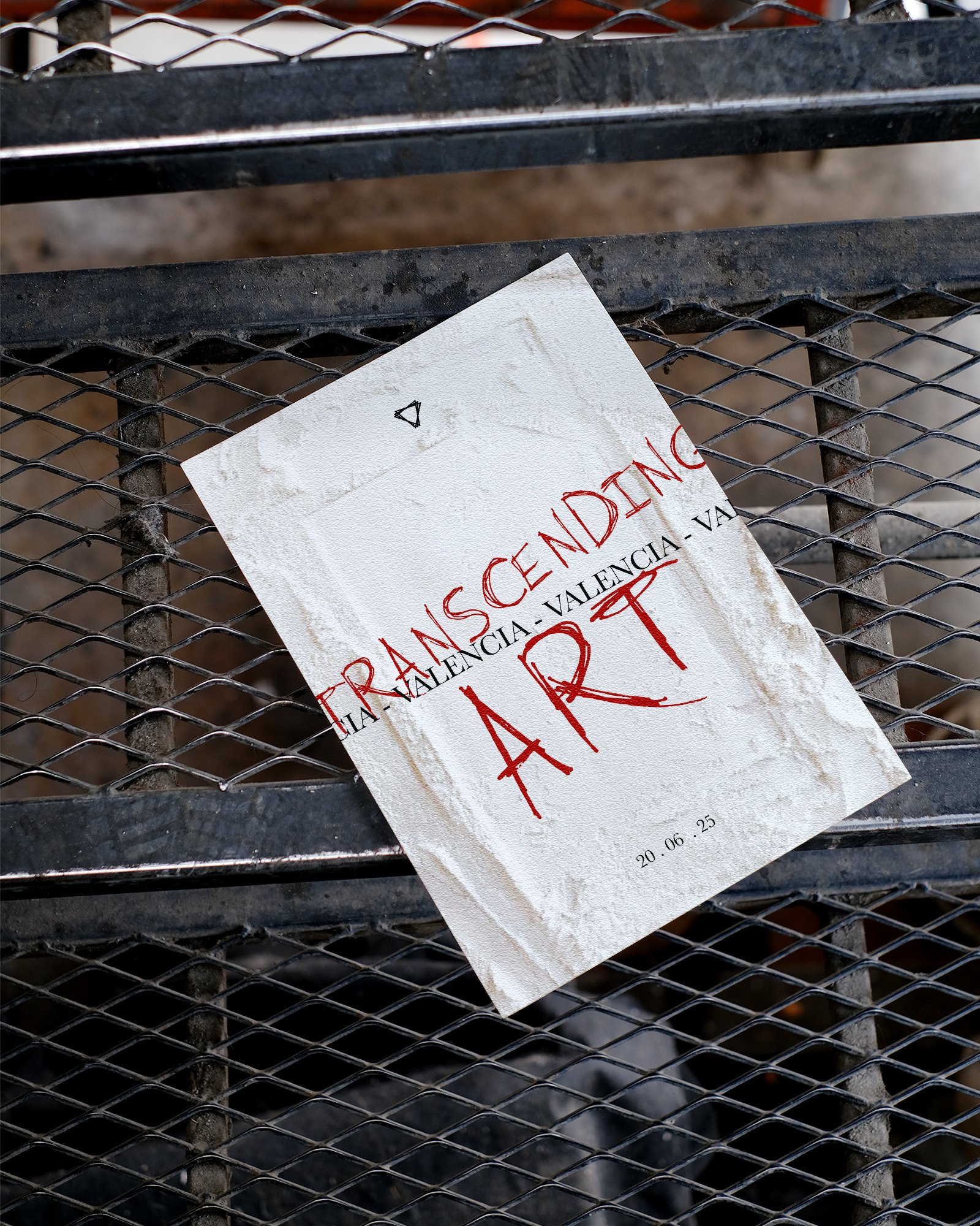
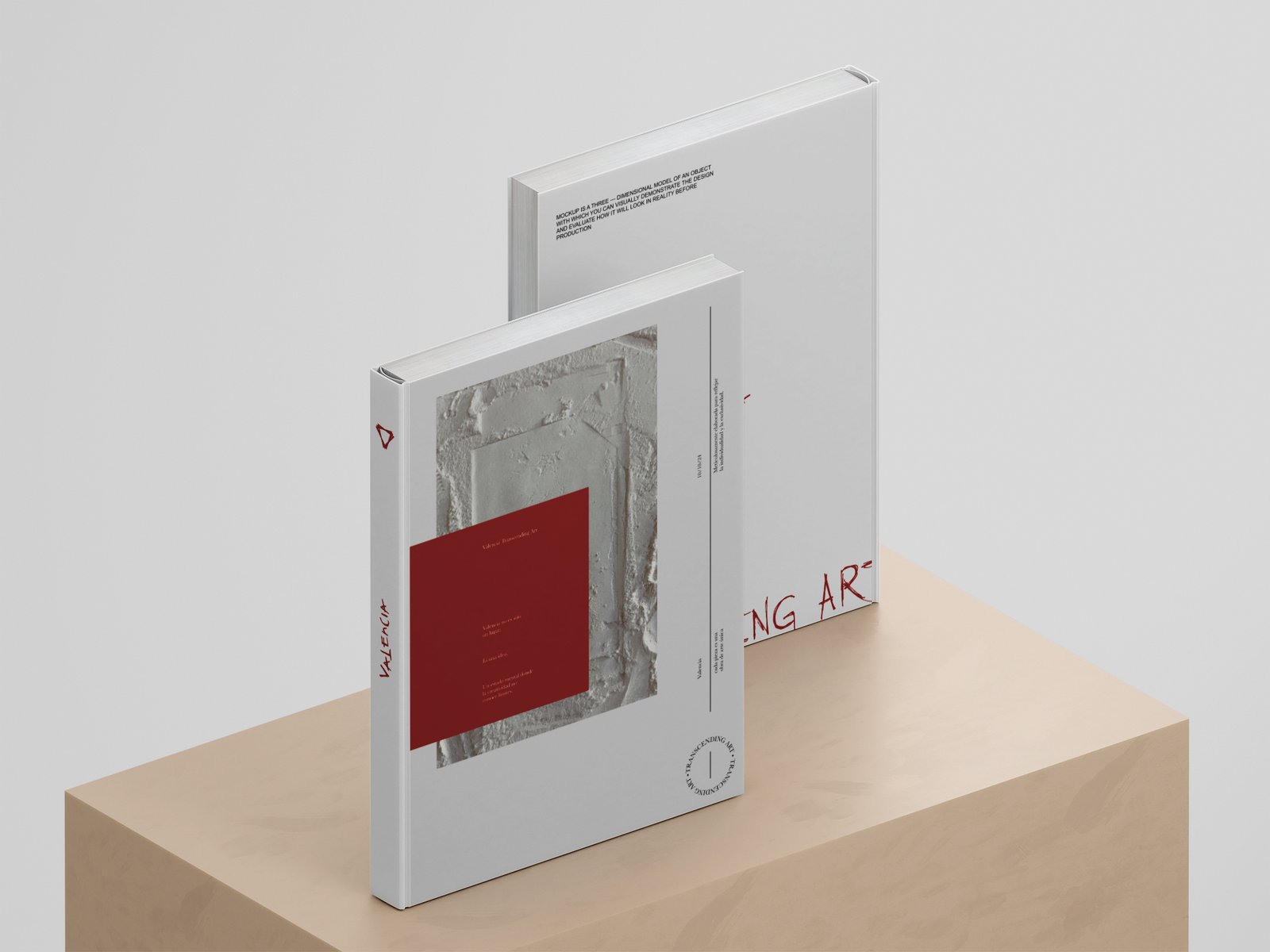
Valencia
Studio
Valencia Studio tells a story where art meets imagination—a seamless connection between the real and the visionary. The brand’s emotional depth and cultural resonance strike a chord with an audience that prizes not only striking beauty but also true, heartfelt authenticity.
Identity
Valencia Studio’s message echoes a profound passion for art, serving as a bridge between the tangible world and the realm of imagination. The brand exudes emotional depth and cultural relevance, resonating with an audience that values aesthetic beauty and genuine authenticity.
Construction & Design
Process & concept
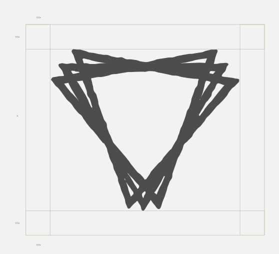
Valencia’s brand identity merges sophistication with artistic expression, using a grayscale palette with Passion Red for depth and contrast. The typography pairs ‘I Know A Ghost’ for bold, unconventional titles with Baskerville for elegance and readability. Organic textures and abstract patterns reflect the brand’s handcrafted essence, embracing imperfection in the creative process. The signature-style logo, paired with a triangular isotype, symbolizes the past, present, and future—capturing Valencia’s vision of art as a timeless, evolving force.
GEN Solutions redefined what branding means for us. Their work on Valencia Studio was executed with the precision and artistry of a seasoned jeweler—transforming our vision into a refined, luminous identity. Every element of our new brand tells a story of creativity and authenticity, and I couldn’t be more delighted with the journey and the results.
Jose A. Quevedo – Founder
BRAND:
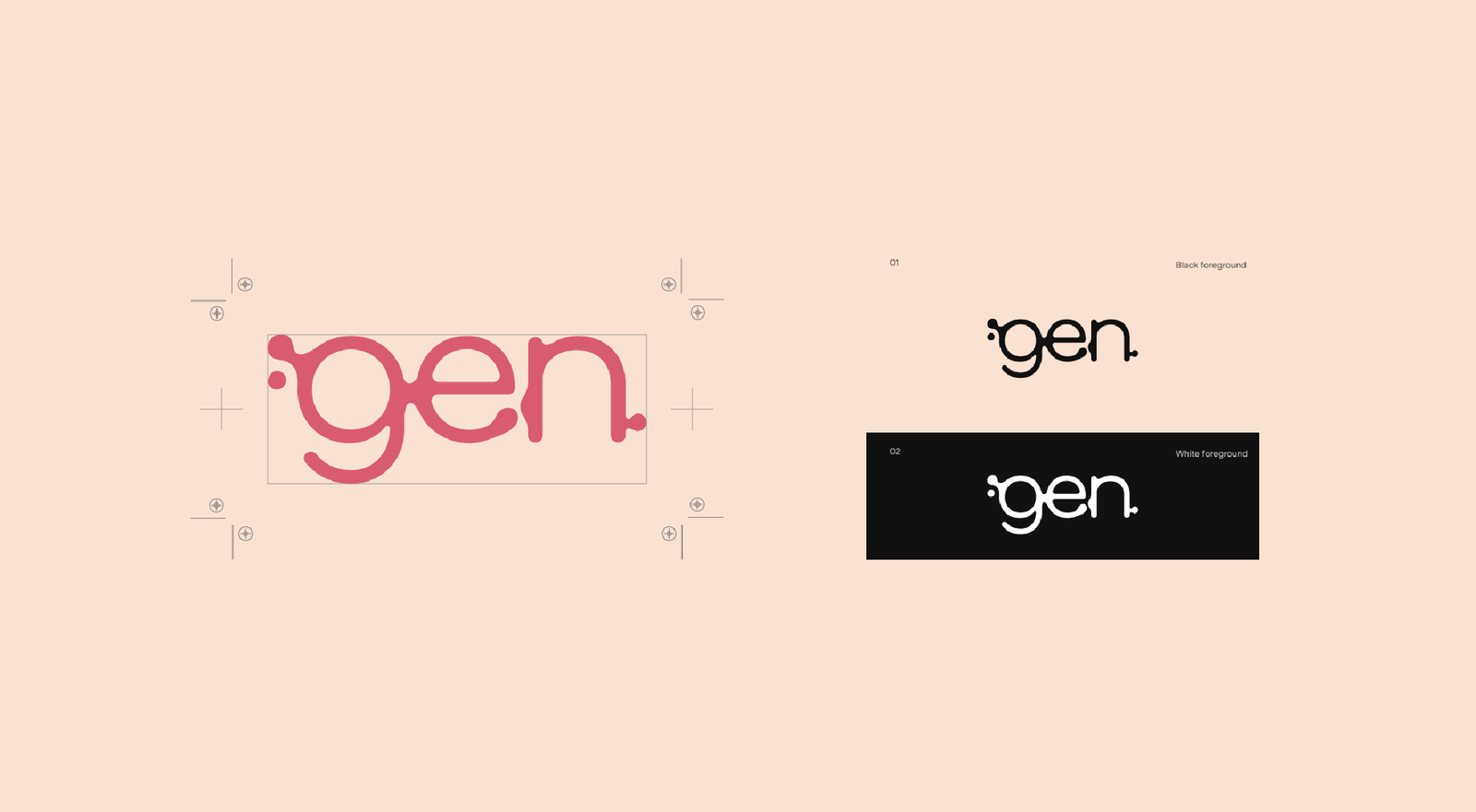
Gen
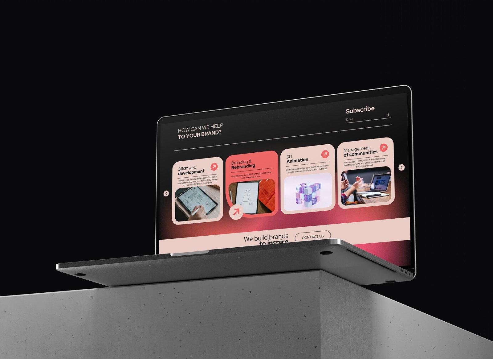
GEN Solutions’ branding is a direct reflection of its philosophy—creativity that connects. Every aspect, from its structured yet dynamic typography to its striking color contrasts, is crafted with precision to mirror the agency’s ability to engineer brand DNA. It’s not just about looking good—it’s about creating an identity that resonates, engages, and stands the test of time.
Identity
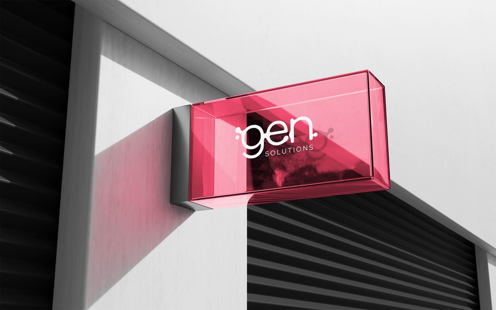
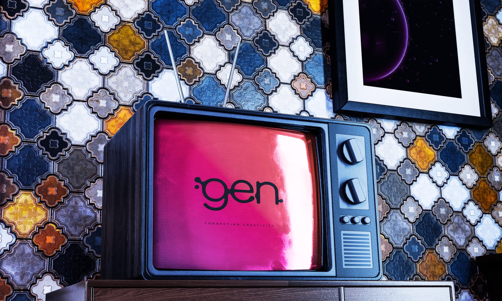
Gen Solutions presents a modern, sophisticated, and minimalist image, using a warm color palette predominantly featuring pink and black to add contrast and elegance. The customized typography stands out for its modern style and readability, while the “GEN” symbol reflects evolution and connection.
Construction & Design
Process & concept
The Gen isologo is presented as an indivisible symbol where text and symbol are integrated into an inseparable unit. This approach reinforces the central idea of the brand: the deep connection between each of the elements that compose it and the synergy created by uniting them.
GEN Solutions was never meant to be just another creative agency—it was designed to be different. Built on the idea that branding is more than a logo or a color palette, it’s the genetic code of a business. From the start, the mission has been clear: to blend artistry with strategy, challenge the ordinary, and create brands that leave a lasting impact.
Juan Pablo Velez – Founder and Director
BRAND:
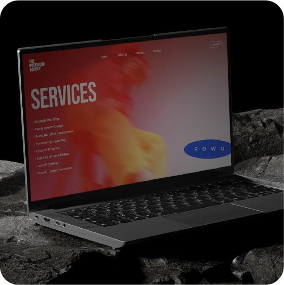
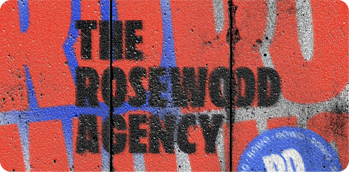
RoWo
Agency
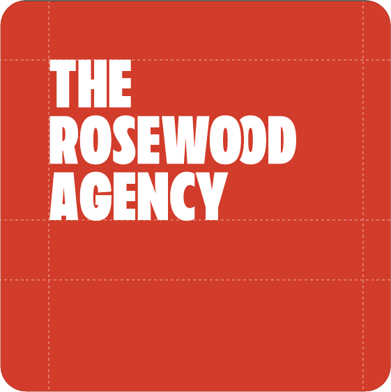
The Rosewood Agency is bold, strategic, and creative. Our identity blends sophistication with an irreverent spirit, striking a balance between professionalism and disruption. We are an agency that dares to challenge the norm, constantly seeking new ways to tell stories and transform brands with real impact.
Identity
The Rosewood Agency exists to empower emerging and established brands by merging creativity with strategy to drive growth and visibility. We specialize in industry-leading content creation, paired with expert Amazon account management and brand consulting. Our mission is to craft compelling brand stories, optimize e-commerce success, and develop innovative marketing strategies that resonate with modern consumers.
Construction & Design
Process & concept
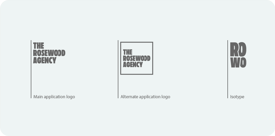
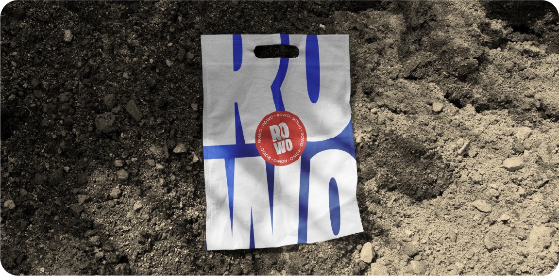
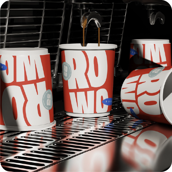
The Rowo logomark is conceived as an indivisible emblem, where wordmark and symbol fuse into a single, cohesive entity. This design reflects the agency’s core philosophy: merging strategic insight with creative execution to drive measurable results. By uniting every graphic element into a harmonious whole, the identity embodies Rowo’s commitment to crafting brand experiences that convert—elevating clients across Amazon, social media, and beyond.
GEN Solutions was never meant to be just another creative agency—it was designed to be different. Built on the idea that branding is more than a logo or a color palette, it’s the genetic code of a business. From the start, the mission has been clear: to blend artistry with strategy, challenge the ordinary, and create brands that leave a lasting impact.
Juan Pablo Velez – Founder and Director
BRAND:
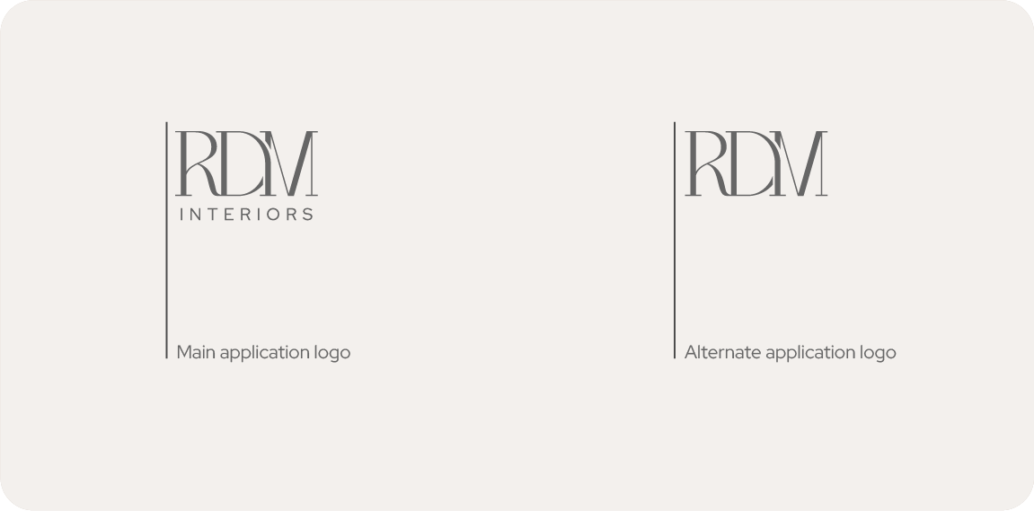
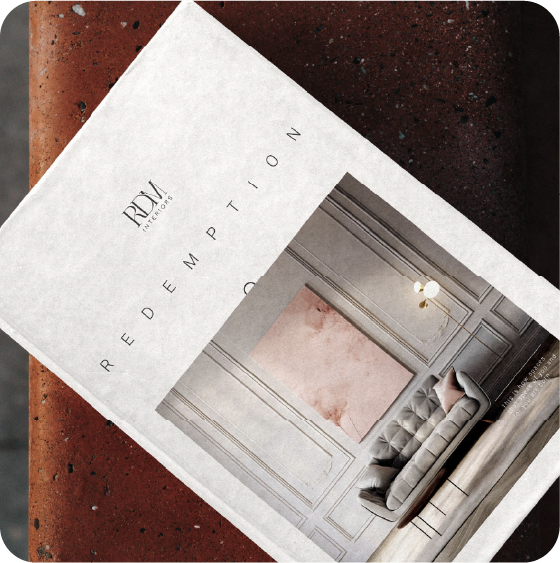
RDM
INTERIOS
It all started with one room. An eleven-year-old girl was moving furniture, changing colors and dreaming of transforming the world, one space at a time. She didn’t know it then, but she was already designing something bigger than just decorating: she was learning to listen to what a space wants to say.
Identity
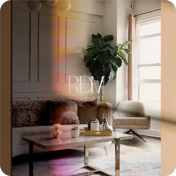
Thus RDM Interiors was born. With the conviction that every space deserves to be restored, redesigned and redeemed. Not only with style, but with soul. Here, light has meaning: it enters every corner, is reflected in geometric shapes, and transforms homes into places of peace, beauty and harmony.
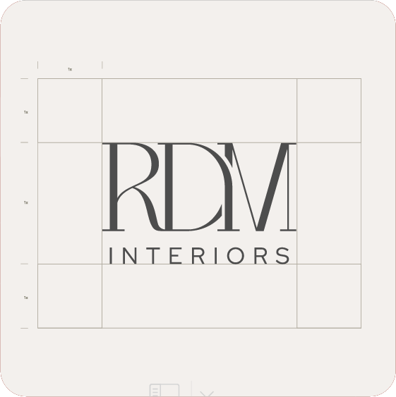
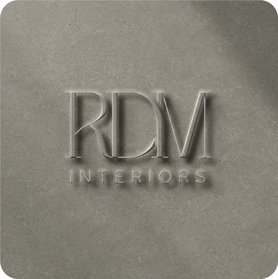
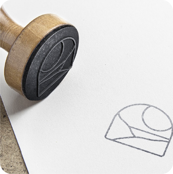
Construction & Design
Process & concept
We believe in design that goes beyond trends. We create environments that tell stories, that feel warm, elegant, and deeply yours. Because when technique meets faith, design becomes something more: an act of love.
Welcome to RDM Interiors. Your new space begins with a new purpose. And it all starts with light.
GEN Solutions was never meant to be just another creative agency—it was designed to be different. Built on the idea that branding is more than a logo or a color palette, it’s the genetic code of a business. From the start, the mission has been clear: to blend artistry with strategy, challenge the ordinary, and create brands that leave a lasting impact.